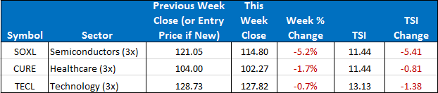
In the Basic model, our three positions are SOXL, TECL, and CURE. In the Stops & Targets model we are out of SOXL, and have full positions in TECL and CURE.
The SPY closed the week up down -0.98%. The ETF Sector Plus model was down -1.66% +2.24%. The ETF Sector Plus Strategy is up +4.95% year-to-date compared to its benchmark, the SPY, which is now up +7.76% year-to-date. The stops and targets model sold off significantly less because the SOXL position is in cash.
This Week’s Strategy Lesson: Measuring Your Model (Part 1 of 3)

If you have spent any time around markets and financial instruments, you know the industry is replete with different metrics. From basic financial ratios to exotic measures of risk, there is no shortage of ways to try and measure and categorize the elements of risk and return you will likely experience trading a model or buying a fund.
And while it can be easy to overlook some of the stats that are thrown out, many of them are very important and understanding what they are trying to communicate and how they all fit together in the big picture can tell us a lot about the characteristics of a model and what to expect. And having the right expectations helps us to trade with appropriate position sizing and stick with the plan when the road gets a little bumpy.
Total Return
This is the most basic “headliner” statistic used. It is almost always expressed as a percentage because most financial instruments and transactions are “scale invariant,” meaning they will function basically the same whether you put $1000 into it or $100,000. A 10% return on $100,000 is a lot more money than a 10% return on $1000, but the percentage return is the same.
One thing to watch for in this area is that not everything associated with trading is scale invariant—namely costs and commissions. If you pay $7 a trade (both ways), this is a miniscule cost on a $10,000 trade (barely a tenth of one percent) but a prohibitively high cost on a $100 trade (a seven percent hurdle that your trade has to make just to breakeven).
It is also useful to see the total return broken out to yearly or periodic returns. This helps you see if the returns are all from just one year or a few periods or if they are spread out evenly across the trading history. The more even or consistent the returns are, the more likely that they are reliable and robust for different market conditions. It doesn’t help you much in 2014 if a trading system made a killing in 2008 but hasn’t done anything since.
Total Returns vs a Benchmark
Total returns are great, but it’s important to put them into perspective. In economics, we have a term called “opportunity costs.” Since our time and money can normally only do one thing at a time, choosing where to spend it is not simply about how much total return we can get, but how does that total return stack up against the next best alternative.
A job paying $15 an hour might seem great until you realize there was another opportunity that offered $20. That means in some sense of the word, that $15 job is costing you $5 in lost earnings potential.
Similarly, a fund claiming to have returned 20% in 2013 might normally sound like a great return, but if you compared that to the S&P500 (SPY), the most commonly used benchmark for equities, you would have seen that it was underperforming last year relative to its benchmark.
What you would like to see is for the model to consistently outperform the benchmark. A return profile where you had blowout returns one year but underperformed all the other years mean that holding that investment might be great if you get “lucky” but in most years, it’s the wrong investment decision.
Largest Drawdowns
This attempts to answer the all-important question: “If I started investing now, and the worst case scenario happened, what’s the most that I could lose?” Of course, it’s not possible to know what the future holds and the past can only tell us so much about what can happened in the future. With these caveats in mind, peak-trough analysis can still give us useful information about the type of volatility you can expect in a trading system or fund.
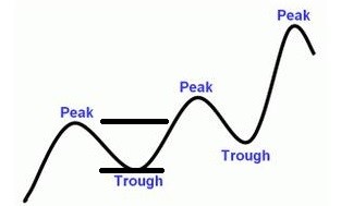
In the graph above, a peak is a local high point and a trough is a local low point (lowest point before putting in a new higher high). The drawdown is defined as the percentage loss from the peak to the trough. As an investor you are both concerned with the severity of the worst drawdown and the characteristics and frequency of the drawdowns that occur in the normal operation of the model.
While the largest drawdown doesn’t tell you your maximum possible risk, if the model uses consistent trading rules and the historical reference period encapsulates many market cycles, it can be great predictor of the worst case scenario. This “maximum” risk can help guide you to position size such that you would be comfortable with this type of drawdown without getting shaken out of your positions. This is important because you have to be able to stick with a system to actually get the returns it offers.
Next week we plan on covering some common trading statistics (like winning percentages and profit factors) and then in the final part we will cover some of the more exotic measurements of risk like the Sharpe ratio, correlation, and the standard deviation of a system relative to the benchmark.
The Current Condition of the Model
For the Sector model, we are in SOXL, TECL, and CURE. The SPY has been in a sideways range and is closing the week near the lows of that range. All three of our holdings closed lower this week but maintain a firm hold on the top three spots. The stops and targets model had a significantly smaller selloff because the SOXL portion of the portfolio remains in cash. No position changes are imminent but stay tuned to the daily updates should any position change.
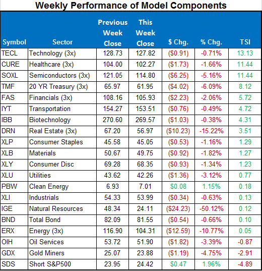
Here is a summary of the weekly performance of all the ETFs that the strategy monitors:
Best wishes for your trading,
James Kimball
Trader & Analyst
MarketGauge