February 22, 2016
Trades & Tutorials
By Geoff Bysshe
To be alerted to posts like this follow us on twitter at @marketgauge.
After big up weeks, what's next?
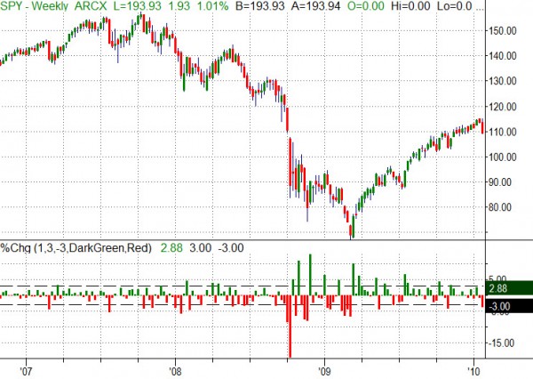
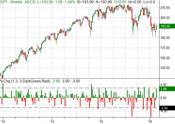
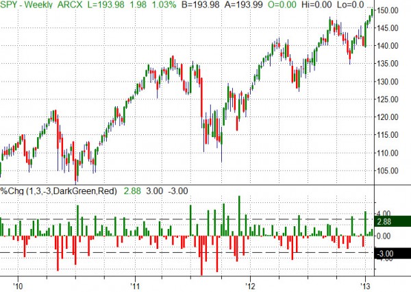
Here's a weekly chart with historgram view of the 1 week percent change in the SPY. The dashed lines are at +/- 3%.
Viewed this way, you may see some interesting patterns and facts. For example, if I use 3% as a rough level...
...A 3% week is not all that common.
...3% down weeks are frequently followed by a 3% up week within a few weeks
...3% up weeks that occur near the lows of more signicant declines often continue higher
Here's the data back to 2007. What do you see?
2013-Feb. 19, 2016
2010-2013
2007-2010