January 25, 2026
Weekly Market Outlook
By Geoff Bysshe
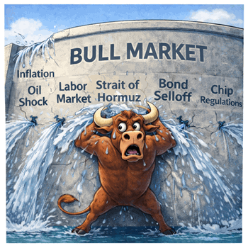
Last week started with a steep decline in stocks that broke key support levels. This drop was a test of the bulls’ resilience and a message from the market that bad news won’t always be a buying opportunity.
Fortunately, for reasons we’ll discuss, the first day of the week was the low of the week.
As this article and Keith’s video below will explain, if last week turns out to be just a bounce followed by a break of last Tuesday’s low, there’s reason to believe a bigger correction is underway.
Geopolitics and The Economy Are Driving Precious Metals & Materials
It was easy to see why gold and silver continued their parabolic ascent last week, but did you see one of the market’s important leading sectors roll over into a warning phase, or the biggest surge in over a year in an important market internals measure?
Last week, the media was fixated on geopolitics. It was hard to ignore.
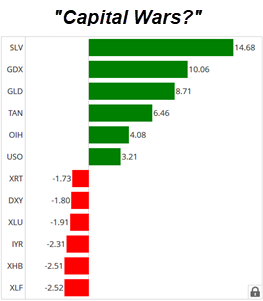
Trump’s demands that he own Greenland took center stage, but Ray Dailio also got some sensationalized attention when he released one of his stereotypical “explainer” videos from Davos in which he labelled the geopolitical atmosphere as “capital wars.”
Significantly less publicized than either of the two messages above, but infinitely more likely to become recognized as one of history’s great speeches, Mark Carney, Prime Minister of Canada, delivered a “special address” that began in French, transitioned to English, pronounced that we are in the midst of, “…a rupture in the world order, the end of a pleasant fiction and the beginning of a harsh reality…”, and proposed a new world order as a solution all in about 17 minutes.
Whether you prefer to listen to President Trump, Ray Dalio, or Mark Carney, you’re likely to come to the same conclusion on one issue – It’s a good idea to own gold.
The chart below shows the best and worst performing sectors along with Gold (GLD), Silver (SLV), and the Dollar (DXY).
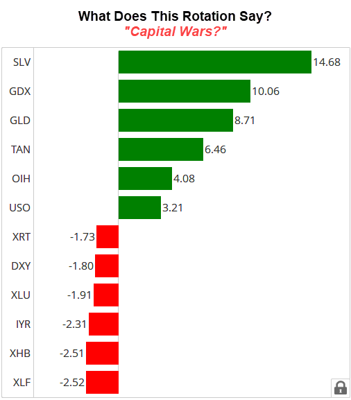
The biggest losers included two of the market’s leading sectors – Money Center Banks (XLF) and Retail (XRT).
The Banks have slipped into a warning phase, meaning they are below their 50-DMA. What happened to this group that was nicely leading the market higher? We’ll explain below.
Another big loser was the dollar.
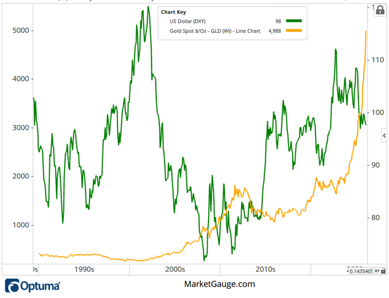
While it's easy to jump to the stereotypical conclusion that gold is going up because the dollar is declining, the long-term perspective shown in the chart below demonstrates that gold is in a bullish trend regardless of what the dollar is doing. The correlation between the two changes dramatically over time.
Rather than stating that gold is up because the dollar is down, a better response would be to ask why both are experiencing big moves – the dollar declining and gold rallying. One answer is in both Ray Dalio’s video and Mark Carney’s speech.
Last week’s leaders were all related to either precious metals or energy.
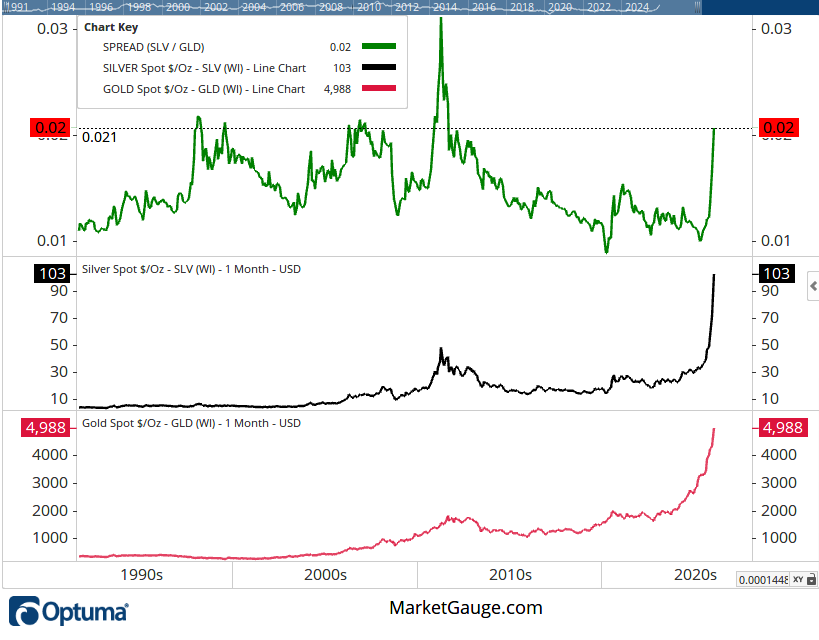
Silver’s move wasn’t only extraordinary on its own; it also pushed its ratio to gold to a level seen in only 3 periods (1998-99, 2006, 2010-11) since 1990.
Stocks Have Shrugged Off Geopolitics With This Silver Lining
If fear of geopolitical uncertainty is driving gold higher, why isn’t it driving stocks lower? It is (or may be) in some areas, but it’s also driving other areas of the market higher such as aerospace, defense, and materials.
If Mark Carney is right, the new world order will lead to more countries feeling they need to spend more to protect themselves, build more of their own supply chains, secure more raw materials for themselves, and more.
Fortunately, the global economy is growing, and in the case of the U.S., it appears to be improving. A growing economy can fuel corporate earnings that, in turn, lead to higher stock prices.
The Economy Is Quietly Supporting Stocks – For Now.
Last week, there were several economic reports that suggested the labor market and inflation are stable, and growth is improving.
On Wednesday, the Atlanta Fed GDP Now report indicated that Q4 GDP is expected to be 5.4%.
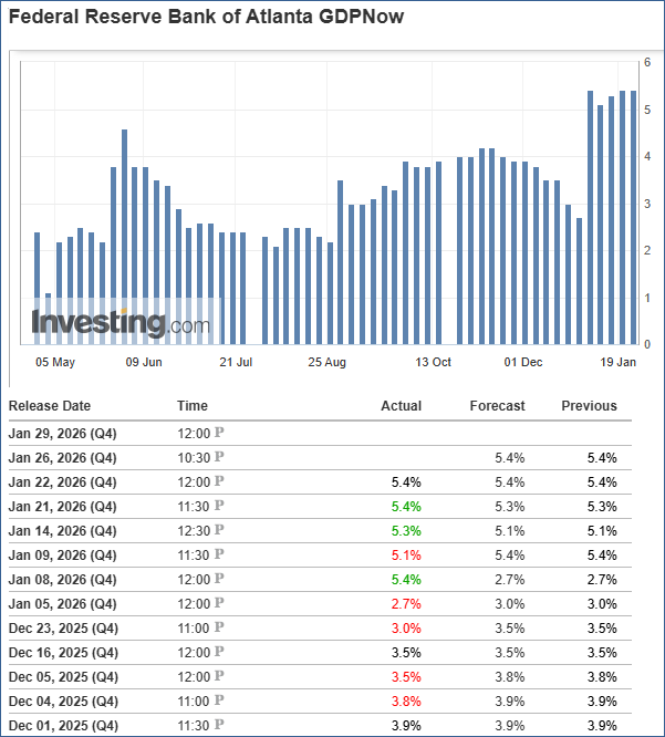
As you can see from the chart above, the GDP estimates for Q4 have increased and have remained higher since December.
On Thursday, the actual GDP for Q3 was reported to be 4.4%, which was slightly better than expectations
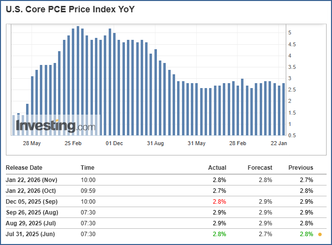
Also on Thursday, the inflation gauge of the Core PCE Price Index reported a value of 2.8%. While this is not the 2% level that the Fed has been targeting, it does represent inflation holding steady around 3% (see chart below), which the market has come to accept, even though experts complain about it.
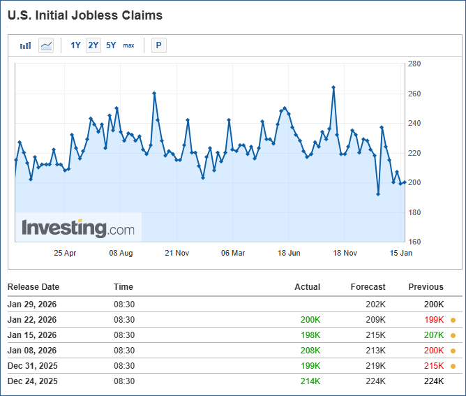
Additionally, initial jobless claims were reported at 200,000, slightly better than the 209,000 forecast. More importantly, it demonstrated that the trend since early November has remained down.
So while world leaders and corporate titans were meeting at Davos, where they were generating global macro and geopolitical fireworks, the stock market was getting positive economic data.
Be Careful What You Wish For. It May Be Too Bullish?
A common refrain in market commentary for months has been a desire to see the market “broaden out.” By many measures, this has happened. For example, the equal-weighted S&P 500 (RSP) and the Russell 2000 Index (IWM) have reached new highs while the SPY and QQQ have struggled.
Remarkably, you can see in the chart below from Big View that the number of 52-week highs reached its highest level since 2024.
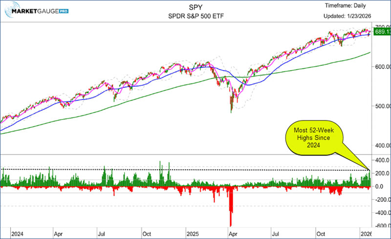
This can be interpreted as overbought when the trend has been accelerating, but the market has been consolidating. A confirming indicator would be for the price to move higher, and the number of new highs continue to expand. If the indexes begin to slip, this spike in new highs may look like overambitious momentum traders buying the strongest stocks after the Greenland controversy drop.
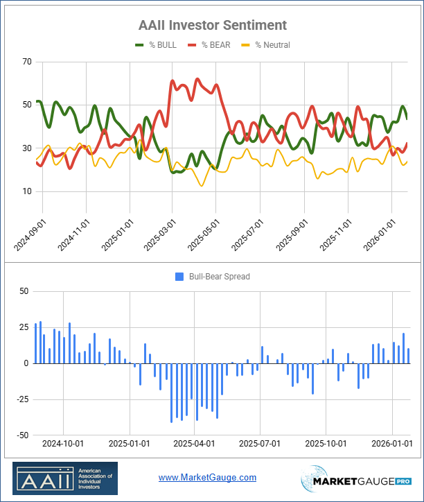
Investor enthusiasm is also running high. The chart of AAII Investor Sentiment below shows that the week before last, the % of Bulls was its highest, while the % of Bears was its lowest, resulting in the spread being the biggest since late 2024.
It’s Ok To Be Bullish, Until Something Goes Wrong.
Recall that the feature image chart of this article showed that XLF was one of the worst-performing sectors last week. This is not a good sign because this had been a leading group at the end of 2025.
As you can see from the annotations on the chart below, when XLF broke above its 50 DMA in November, it had 3 of the 4 indicators in a bullish position.
When it started to break under its 10 DMA in early January, the faster Real Motion indicator had started to turn negative. By the time the price pulled back to the 50 DMA, all 4 indicators were bearish. This condition suggests that the MA can be easily broken and the price will extend lower, as it has.
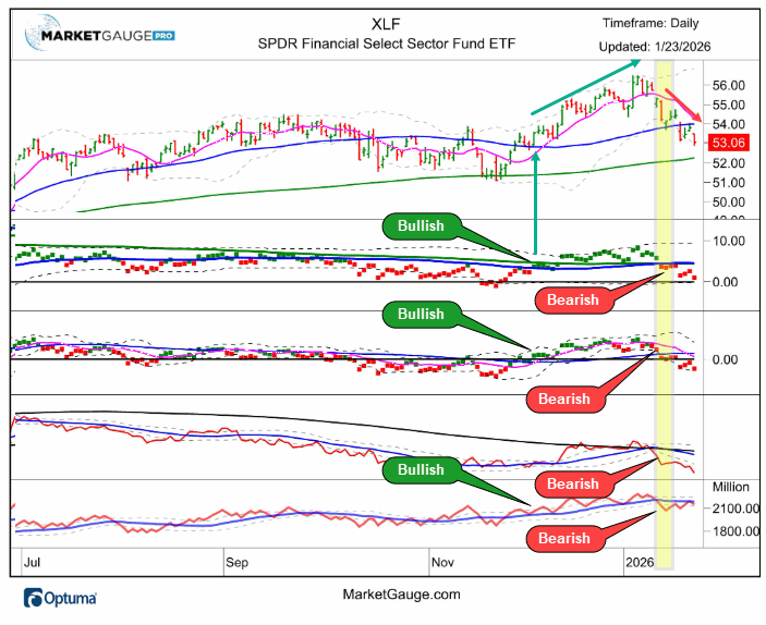
** You can find the chart of above with all key indicators for all the symbols in the sectors summary table in Big View here.
Unfortunately, there is a fundamental reason for the group’s underperformance. Earning reports have been missing expectations. In many cases, earnings growth has been strong, but analysts' estimates were too bullish.
As you can see below in the chart of FactSet’s reporting on the 10 worst earnings misses of the week, 7 of the 10 were banks.
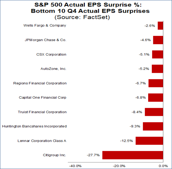
Missing expectations and weak momentum indicators are bearish conditions that will need to be worked off for this group to regain its status as a market leader.
The bulls continue to point to the financials as a leading group. I’d fact-check them with the charts in Big View’s Sector Summary.
How Bad Is it?
Last week’s issue of Market Outlook provided a very timely look at the January Calendar Range as a guide for anticipating the markets’ trend right now and throughout the year.
This analysis was just in time for Tuesday’s gap lower in stock, which continued lower to close below the January low and the 50 DMA in both the SPY and QQQ. Tuesday’s breakdown, however, became Wednesday’s reversal, which continued in varying degrees throughout the week.
However, as we just learned, the XLF didn’t bounce back. It also closed the week below its January Calendar Range low. This is bearish for the XLF and not a good sign for the market.
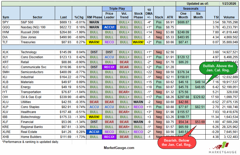
However, as you can see with the table below (taken from the Seasonality section of Big View), XLF is the only group below its January range. In fact, there’s only one other group that is below its January opening range (Utilities).
Furthermore, the “Stock Phase” column shows that most of the groups are in Bullish phases, which means price over the 50 DMA and the 50 over the 200 DMA.
If you’d like to learn more about the Calendar Ranges' significance and how to use them to anticipate trends and reversals, refer to last week’s Market Outlook.
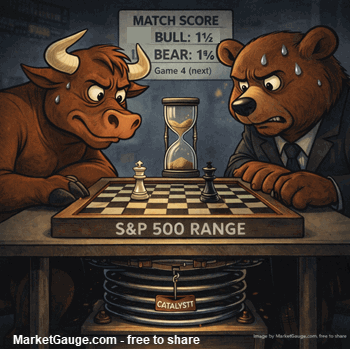
Bottom or Bounce? The Calendar Ranges Will Tell.
With financials — especially the big banks — typically leading earnings season, their underperformance and earnings disappointments set a cautious tone.
If the broader market follows their lead, the bounce we saw last week may turn out to be just that — a bounce, not a bottom. If XLF continues to slide, the risk of a correction increases.
However, the market’s resilience in the face of war, political drama, and rising gold suggests a deeper strength. A strong economy, steady employment, and cooling inflation could support a durable rally — provided earnings expectations weren’t set too high.
The two big levels to watch on the downside in the indexes, the sectors, and individual stocks are the January Calendar Range low that was set LAST THURSDAY and the 50 DMA.
On the upside, follow the leaders.
If you'd like access to the MarketGauge indicators, strategies, automated trading models, and more, contact us.
Best wishes for your trading,
Geoff Bysshe
As promised, for a deeper perspective on the tectonic shifts in geopolitics and capital flows presented by Ray Dalio’s video and Mark Carney's Special Address at Davos.
 |
 Every week we review the big picture of the market's technical condition as seen through the lens of our Big View data charts. Every week we review the big picture of the market's technical condition as seen through the lens of our Big View data charts.
The bullets provide a quick summary organized by conditions we see as being risk-on, risk-off, or neutral. The video analysis dives deeper. |
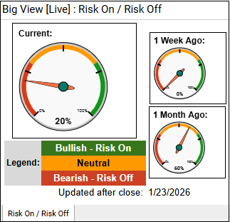
Summary: Overall conditions remain risk-on as major indexes hold bullish phases, market internals and new-high/new-low trends are strong, volatility is subdued, global markets are leading, and seasonal trends stay supportive into mid-February. However, risk-off undercurrents are rising with weak volume patterns, ongoing growth underperformance, and a sharp surge in gold, silver, oil, and a breakdown in the dollar—suggesting growing defensive behavior and macro or geopolitical stress beneath the surface.
Risk On
Neutral
Risk Off

Every week you'll gain actionable insight with: