February 22, 2026
Weekly Market Outlook
By Geoff Bysshe

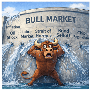
Despite plenty of news around earnings season, geopolitics, and the economy, the S&P 500 has had the tightest YTD range in over 50 years.

However, as we discussed in last week’s Market Outlook, the individual stocks and sectors have been unusually volatile, and there’s reason to believe this volatility and the active investing opportunities it provides will continue in 2026.
In fact, the MarketGauge framework for identifying the best trends has done a great job of identifying which stocks and sectors are likely to have persistent trends versus those that are likely to change course.
The tight range in the S&P 500 and the choppy correction in the QQQ have resulted from AI-related tech stocks faltering as other sectors and themes rallied.
As a result, measuring the health of the sectors will help anticipate whether the market will break higher or lower in the future.
A Quick Way To Follow What’s Happening In The Market
On Big View’s Sector Summary page, you’ll find the table below. This table shows the performance of the major sectors with several important measures in addition to the day’s price change.
All the indicators (highlighted in red boxes) other than the Percent Price Change measure the trend's health from different perspectives.

The table represents a quick way to see what areas are bullish in terms of
If the background is colored, then it just moved into the current condition. For example, Transportation has a green background just moved into a bullish RM10 condition on this day.
The MarketGauge Framework For Anticipating Market Trends.
A shortcut for identifying sectors that are becoming more bullish is to look at the sectors that have the most “Bull” or Warn” indicators. For bearish trends, look at the indicators that have the most “Bear” or “Dist.”
For simplicity, I put a green box on the XLI row to highlight a sector that is bullish on every indicator.
Below is the XLI chart with the indicators on the chart with explanations of why they are “bullish.”
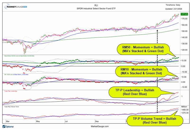
A simple rule of thumb is Real Motion is bullish when there is a green dot, and more bullish when the fast MA is over the slow MA.
For Triple Play Price and Volume Trend, the fast line should be over the slow line (red over blue).
As you can see at the black dashed arrow on the chart, when XLI started to move over the months of consolidation, all of the indicators were turning more bullish. This typically indicates a strong trend. Breakouts without bullish RM and TP are more likely to fail.
You’ll find these charts for all the sectors on the sector summary page. If the market starts to break its range up or down, use these indicators to identify the best trends to anticipate that will follow through.
If all or most of the indicators are bullish, then that is a stock or a sector trend that is likely to continue even if the market isn’t cooperating. XLI is a good example of this.
It’s hard to predict when the market will break out of its range, but there are a lot of opportunities in sectors and individual stocks.
The Sector Summary page has everything you need to be one step ahead of the market’s action and sector rotation.
Use this page to see how powerful the MarketGauge framework can be on sectors, and it works just as well on individual stocks.
Want Better Tools, Trading Systems and Market Insight?
If you'd like access to the MarketGauge indicators, strategies, automated trading models, and more, contact us.
Best wishes for your trading,
Geoff Bysshe
 |
 Every week we review the big picture of the market's technical condition as seen through the lens of our Big View data charts. Every week we review the big picture of the market's technical condition as seen through the lens of our Big View data charts.
The bullets provide a quick summary organized by conditions we see as being risk-on, risk-off, or neutral. The video analysis dives deeper. |
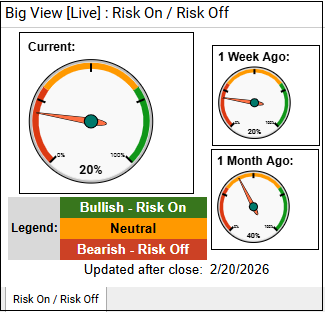
Summary: All major indexes finished the week higher, with the S&P reclaiming its bull phase and market internals, sector breadth, value leadership, and strong performance in semiconductors and emerging markets confirming broadly positive price action. However, elevated volatility, strength in defensive assets like metals, utilities, gold, and oil, a risk-off reading from the risk gauge, and weaker seasonality suggest underlying caution despite the bullish tone.
Risk On
Neutral
Risk Off

Every week you'll gain actionable insight with: