January 18, 2026
Weekly Market Outlook
By Geoff Bysshe

Last Thursday concluded the first 10 trading days of the year. This calendar date is becoming increasingly important to active investors seeking better returns by using simple tactical trading strategies, as you’ll learn below.
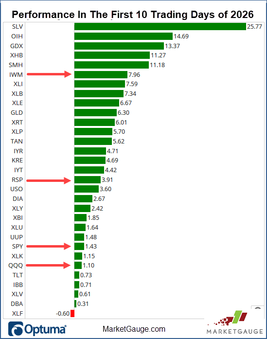
This year, the Small Caps took a commanding lead in the opening 10 days, and it’s not gone unnoticed. The media, Wall St. strategists, and retail investors all love to root for Small Caps as if they're Wall Street’s underdogs.
Maybe it's because when you look at the data, they are the underdogs.
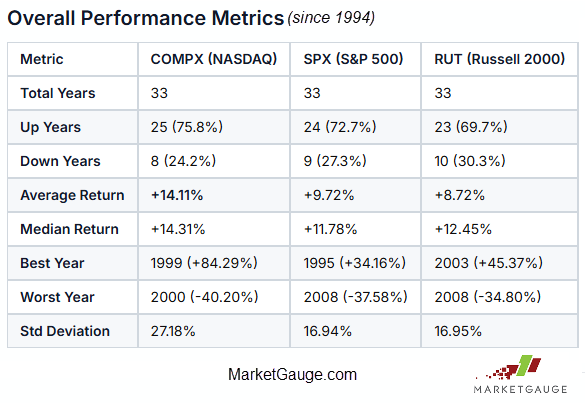
Considering the period back to 1994, the Russell 2000 (RUT, IWM), also known as “Grandpa Russell” in Mish’s Modern Economic Family, has only led the year after the first 10 trading days 33% of the time.
This isn’t surprising. When we look at the three major indexes, Nasdaq, S&P 500, and Russell 2000, we’ll see that their performance is not all the same, and Nasdaq is hard to beat.
As we dig deeper, we’ll find more strengths and weaknesses for each index.
The starting point, however, is MarketGauge’s January Calendar Range period (the first 10 trading days of the year), and the small caps, Grandpa Russell (RUT, IWM), have stolen the show.
Is “Grandpa” and The Small Cap Universe Really Shaping Up This Time?
The IWM isn’t just leading; it’s been remarkably strong, and its trend has been historically consistent.
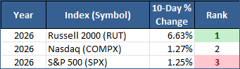
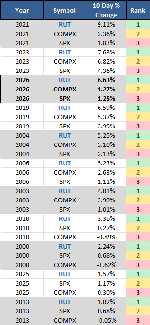
As you can see from the table below, which lists the 11 times IWM was the leader in the first 10 days of the year, this year ranks among the top 3 years in which the Russell 2k (RUT) was the leader. Its 6.63% gain is well above the 4.60% average gain of the other 10 years.
Fun facts, but does it matter?
Does the performance of the first 10 days offer any insight into how the rest of the year will perform? Unfortunately, when you consider all years and ignore which index is leading, an objective look at the data suggests that the simple measure of the direction of the first 10 days is not a reliable indicator of the market’s annual performance.
However, when you isolate the years in which small caps are the leader…
The short answer is YES. In 9 out of 10 years that IWM led after 10 days, the market closed the year higher than it was after the first 10 days.
The next likely question would be, should you buy the IWM, expecting it to outperform the other indexes throughout the year?
Will IWM Lead For The Year?
In future articles, we’ll dive into the fundamentals that will influence that answer, but the technicians would say “flip a coin.”
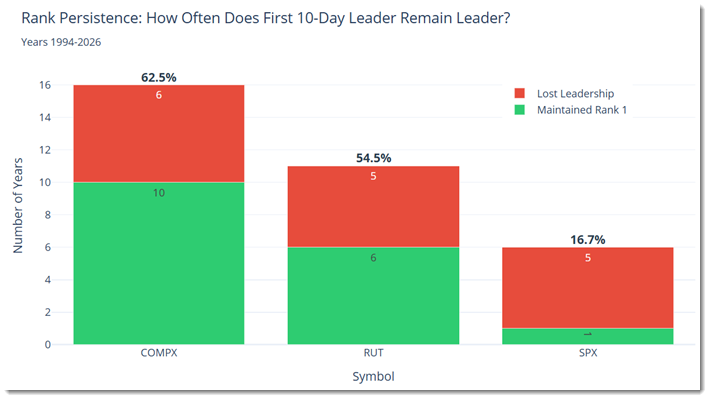
In the chart below you’ll find the percentage of times that the #1 ranked index after 10 days remains the #1 rank at the end of the year. It’s not surprising that the most bullish index (Nasdaq) has the highest rate (62.5%) of maintaining its #1 rank. IWM’s record is 54%.
It’s Not The Size or Direction of the Initial Move That Matters Most
One of the trailing stops and simple risk management tactics we teach in our Active Investing Edge service is based on the prior day’s low. This tactic quickly identifies trend strength and enables you to confidently ride the most explosive moves with a tight stop that works.
Here’s how this relates to the IWM this year.
Since breaking out of its January opening range (Day 1). The IWM has not traded meaningfully below the low of any prior day. 8 days into its bullish streak, it traded $0.25 or .09% under the prior day’s low, then continued to put in higher lows for the next two days
As you can see from the table below, one lower low out of 10 days is a sign of bullish strength in the right market context (which is the bullish context we currently have).
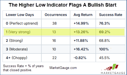
This strength is particularly noteworthy given that expectations for future Fed rate cuts have diminished, and the trading patterns in SPY and QQQ have been only slightly bullish and neutral, respectively.
The BIG Question That Turns Mediocre Trade Set Ups
Into A “100% Winner.”
More important than January’s initial moves of the first day, 5 days, 10 days, or even the whole month, is what happens next.
We look at the 10-day range very closely for the rest of the year because it can provide valuable insight into the markets’ future trends. It also serves as a risk management tool when used properly.
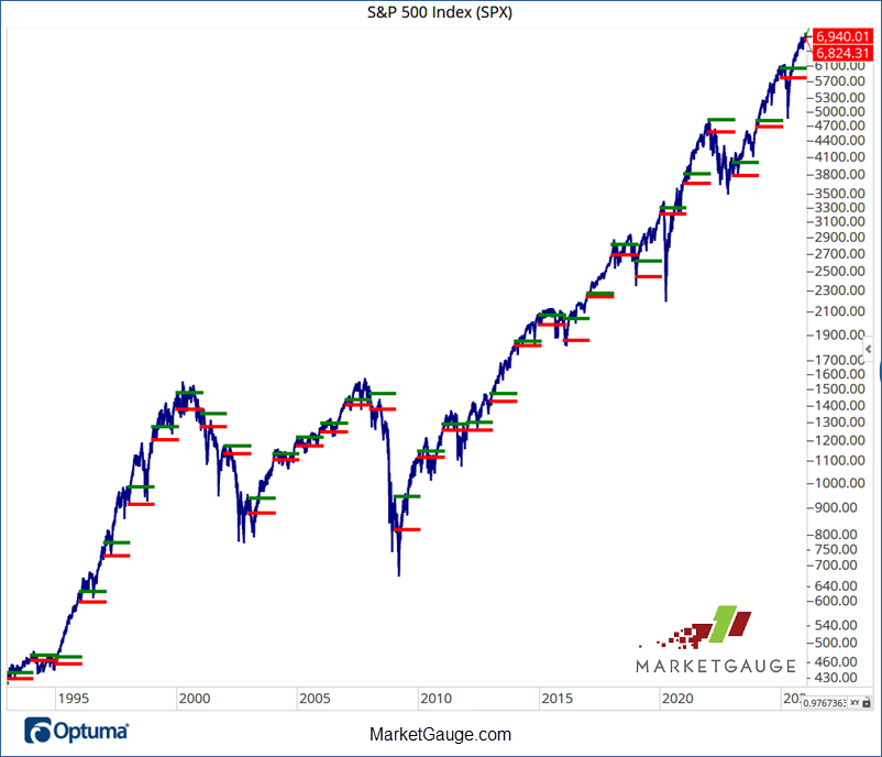
The chart below shows the S&P 500 with its first 10 trading days marked with red (the low) and green (the high) lines. As you can see, a simple rule of being bullish over the green lines and bearish under the red lines would have served you well.
This Isn’t Just For Stock Indexes
This indicator is effective on all stock markets, ETFs, and stocks.
We’ve been covering this trading strategy in this article for the last several weeks, so if you’d like to learn more about reading and using the “Calendar Ranges” and the “January Trend Trade,” check the recent Market Outlook articles, and if you’d like specific trading strategies based on it, you can get all your questions answered here: www.marketgauge.com/call
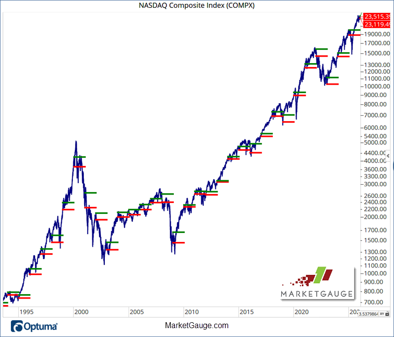
Here’s the historical Calendar Ranges view of the Nasdaq market below.
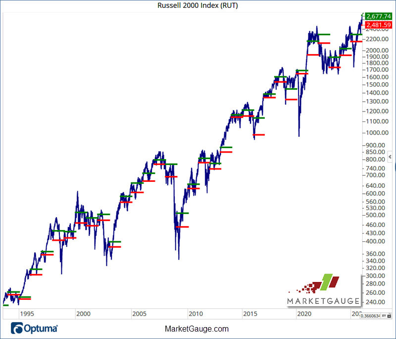
Here’s The Russell 2000 (RUT).
The big question active investors should watch for now is…
“Does the market break its January Calendar Range low?
The January low is a big inflection point that can be used to avoid very bearish situations and identify big bullish opportunities.
If the volatility expected by so many on Wall Street occurs this year, understanding how to trade price levels will give you a big edge.
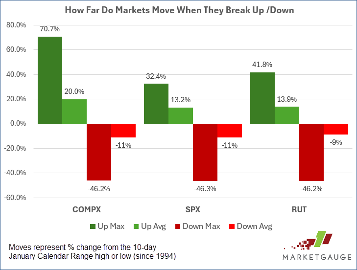
The chart below shows how big the moves can be when the January range is broken in either direction.
The max drawdowns of around 46% are all related to the 2008 bear market. The average decline of about 11% is much more palatable, but how can you get the best of both – avoid the max drawdown and prevent getting washed out of good trades by an 11% move against you?
The critical question for the "1 lower low day" pattern is:
"Will January Low hold for the entire year?"
If YES (has happened 53.8% of the time):
If NO (has happened 46.2% of the time):
This transforms the pattern from a "generally bullish" signal (+13.26% average for all 13 occurrences) into a binary outcome with two very different outcomes based on whether January Low holds:
Tactical Trading Avoids The Biggest Declines and
Keeps You In The Game To Catch The Gains
One of the best protective stop tactics and bullish reversal entry triggers is the market inflection point of the January Calendar Range low.
The data above shows how dangerous the market can be when it trades “down on the year.” It can be a very emotional event that often leads to a spike in fear and a wave of selling.
In our Active Investing Edge and Calendar Ranges services, we use this inflection point as a protective stop level, and a trigger to buy bearish markets that are recovering.
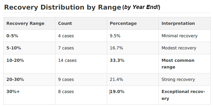
Below you’ll see the statistics that demonstrate how profitable these “recovery” moves can be. Keep in mind that the recovery is only being measured from the point of crossing up and over the January Calendar Range low until the close of the year.
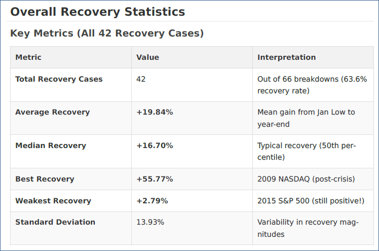
As the details below show, the most common recovery is between 10% - 20%, and:
Putting The Edges Together
This year is off to a strong and unique start. The IWM is leading with an unusually large move and an extremely bullish pattern of consecutive higher lows.
The IWM doesn’t have a great record of maintaining its status as the best-performing index, but its early leadership has historically preceded bullish years for stocks in general. In fact, 90% of the last 10 years in which IWM was the leader after the first 10 days, the market has closed higher than its initial 10-day move.
How To Tactically Manage The Risk
Rather Than Trusting The Market Will End 2026 Higher
The big indicator that would turn this bullish scenario bearish would be a breach of the January Calendar Range low.
For example, recall the Tariff tantrum period of early 2025 and notice that the steep declines all began from under its January low.
(Click to watch the video of Grandpa’s Ride In 2026)

Using the January Calendar Range low to determine how serious a bearish correction will be is heavily influenced by the context of the market environment.
While this may be a broad stereotype, the last 3 decades have provided a good template for managing your expectations for market behavior.
Recovery Analysis by Decade
1990s (1997-1999): Early Success
2000s (2000-2009): Crisis & Recovery
2010s (2010-2019): Steady Growth
2020s (2020-2025): Modern Era
How To Be Prepared For Tactical Opportunities in 2026
As we frequently discuss in this article, the fundamentals that impact earnings drive the long-term trend, and the market’s narrative and technicals guide short and intermediate-term volatility.
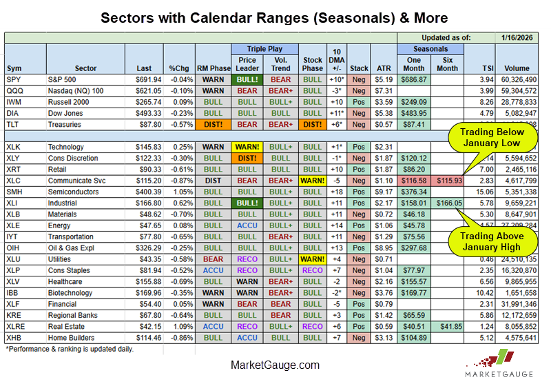
It’s not just the IWM that has stood out as a new leader; the equal-weight S&P 500 (RSP) has also outperformed, led by cyclical parts of the market, as you can see in the chart below.
As you can see in the chart above, investors have favored materials (SLV, XLB), industrials (XLI), energy (OIH, XLE), and more cyclical areas of the market than the big cap tech (XLK, QQQ).
Semiconductors (SMH) have continued to lead, but there has been rotation within that sector into the more cyclical and industrial semiconductor companies, which has kept the group strong.
This broadening of the market and move away from “big cap tech” has kept the bull market strong, but it requires more participation than in the days of 2023-2024 when the Magnificent 7 stocks could almost single handedly pump up the indexes.
While every technical analyst will be watching this market rotation in the context of the 50-day and 200-day moving averages, MarketGauge investors will also be watching the sectors’ performance relative to the January Calendar ranges.
These ranges provide early warnings of weakness or strength, a measure of sentiment, great trading inflection points, and more. Additionally, looking at how many sectors are trading above or below their January Ranges can provide a good indication of general market strength and sentiment.
This table in Big View provides an easy way to track sectors and the main indexes based on most of MarketGauge’s proprietary indicators including the Calendar Rages.
Conclusion
The market’s first moves of January suggest a good year ahead, but not necessarily one in which you can just buy the leaders and hold them all year.
If you’d like to see the market rotation before others, and if you’d like a simple strategy for buying recoveries after market corrections, get to know the Calendar Ranges on the indexes, sectors, and your favorite stocks.
If you'd like access to the MarketGauge indicators, strategies, automated trading models, and more, contact us.
Best wishes for your trading,
Geoff Bysshe
 |
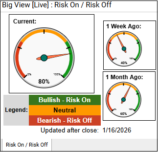 Every week we review the big picture of the market's technical condition as seen through the lens of our Big View data charts. Every week we review the big picture of the market's technical condition as seen through the lens of our Big View data charts.
The bullets provide a quick summary organized by conditions we see as being risk-on, risk-off, or neutral. The video analysis dives deeper. |
Summary: Overall, the market remains broadly risk-on as most indexes are still in bull phases, market internals and new-high/new-low ratios are constructive, leadership is expanding into small caps and foreign markets, and seasonality remains supportive into mid-February. However, mixed volume, weakness in QQQ and growth stocks, surging metals, utilities’ relative strength, and a potential volatility breakout introduce caution, suggesting a healthy but increasingly fragile risk-on environment with rising risk-off crosscurrents.
Risk On
Neutral
Risk Off

Every week you'll gain actionable insight with: