September 7, 2025
Weekly Market Outlook
By Geoff Bysshe

Are you tired of hearing that the average monthly return data for September is bearish?
You may even be tired of saying it by now. I am.
The phrase “September is a bearish month” also frustrates the hell out of me when it’s not followed by some context or perspective that is helpful.
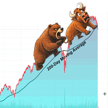
The typical data used to support the claim “September is a bearish month” typically looks like the chart below.

Everything about that chart above is true, but it hardly provides enough context or perspective to be helpful. In fact, it’s dangerous considering that missing a big up move can be as frustrating and costly in your efforts to build your wealth as getting hurt by a big down move.
You can find the chart above and others like it on the major indexes and sectors in our Big View Seasonality section here, but I wouldn’t click on that link before completing this article!
We are very repetitive in saying when presenting any data or trade opportunity that is described by a single chart – “What’s your risk?”
If you can answer “What’s your risk?” as we teach, you’ll have considered the chart’s context and your perspective!
As a result, the focus of most Market Outlook articles extends this question to “what’s the context and perspective?”
“Context” vs. “Perspective”
At the risk of sounding like an English professor (which I am not!) with an obsession with data-driven results from both discretionary and algorithmic models and systems, I’m going to take a look at September a little more completely.
To be clear, this will still be a high-level look at how we look at markets in our internal processes.
First, I realized this week that I’ve never described the underlying thought process by which I like to construct the weekly Market Outlook commentary.
It’s based on this principle:
“Context × Perspective = Insight à Edge à consistent, predictable results”
Improve your context, understand your perspective, and you’ll get better results.
Context and Perspective are not synonyms.
Each does a different job.
For example, below you’ll find a chart that shows some context for the same 10 years considered in the chart above. It shows the relative Year-to-Date performance of each of the last 10 years up to the end of August.
It answers a simple question – how were these years performing before September?

You’ll notice some of the years are formatted as dashed lines while others are solid. There is a significance to this. The current year is solid magenta to highlight it, but its formatting as solid vs dashed is not relevant.
Can you figure out why I would have formatted some years differently to show two cohorts within the data?
Hint: context for what’s next…
Before we figure out the chart, let’s get clear on this…
Context and Perspective are not synonyms.
Each does a different job.
Context = the facts and conditions surrounding the data.
It answers what/when/where: time period, data choices (price vs. total return; nominal vs. real), market regime (low/high inflation, rate cycle), index construction changes, major policy events, etc. It anchors the environment in which past price action occurred.
Perspective = the lens you choose to interpret those facts.
It answers from what vantage point and why it matters: trend-following vs. valuation, momentum vs. mean-reversion, investor time horizon, risk framework (e.g., risk-on/off), and the specific tools you’ll use (e.g., moving-average “stack,” momentum indicators, leadership and volume trends).
With that in mind, the context of the chart above is the YTD performance of the market prior to September.
Now look at the performance of all these same years during September.
In this chart, I’ve formatted the years that ended September with a positive return with dashes, and the negative years are solid (the current year is solid, but this formatting rule doesn’t apply here, as it has not ended)
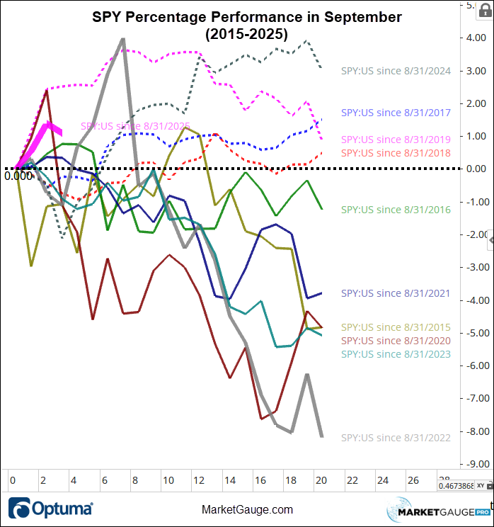
Here are a few observations:
Summary: In the last 10 years (which have been a focus of the “September is a bearish month” analysis), the extent to which September has been bearish is correlated to the context of the YTD trend going into September.
Looking at More History
10 years isn’t a big sample size, but it does describe the recent market environment.
Now let’s look at the same charts going back to 1994, so we can capture the Dot.com years and the Great Financial Crisis, and more
For a little context, here is a log scale chart of the period with the July Calendar Range indicators on it. If you’re a follower of our Calendar Ranges, I hope you’re watching them closely NOW. If you’re not following our Calendar Ranges, why not?! Contact Rob, our Chief Customer Success Officer, at www.marketgauge.com/call
First, here’s how September has trended since 1994.
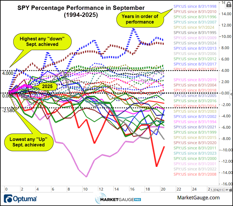
Before looking at the YTD context, here are a few observations:
Here’s the YTD context below. The thicker lines and dashed lines are the 3 most up and most down from the chart above, and are then carried over to the chart below.
Observations considering the YTD context.
Conclusion
The simple context of the YTD trend has a significant impact on the frequency and magnitude of the bullish or bearish move one should expect in September.
Simple Perspective That Provides Insight & Tactics
In our discretionary trading strategies, we make use of several important Calendar Ranges to indicate when trends are likely to continue. In the case of September’s performance, there are two ranges that are particularly important.
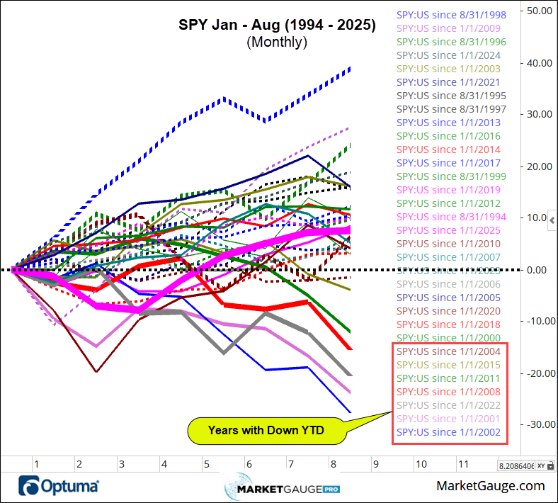
As mentioned above, the charts show how months that start up stay up and vice versa. In last week’s Market Outlook, I shared charts that summarize this idea. Here they are again below.
This chart shows that the bearishness in September is much more severe in the latter part of the month.
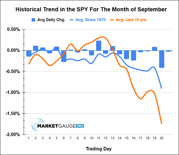
What you can’t see in the chart above is that the bearishness is concentrated in the months that are already down at the mid-month time frame. Again, context is power!
Look at the chart below, which isolates the months that closed up vs. the months that closed down.
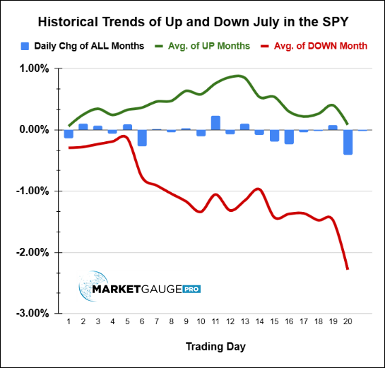
As you can see, bullish months tend to pull back, while bearish months worsen as the month progresses.
Whether you look at the data in aggregate or year by year, the same patterns and statistics prevail. Yes, September deserves its reputation for being volatile, but for the savvy active investor…
September’s not all bad, until it is, and when you know what to look for, you can see it coming.
At MarketGauge, we help discretionary traders get better, more consistent results by understanding and identifying contexts that give you an edge, then applying perspectives that profit from the edge.
With a little practice, reading markets with a focus on relevant context and applying a tactical perspective will also enable you to make much better use of the countless statistics that are often dangerously only half true.
If you prefer to have computers (algorithmic systems) do all the work for you. We provide individuals and asset managers with systems that build wealth with automated strategies grounded in contextual edges and perspectives. These systems provide tactical portfolio management that minimizes drawdowns without sacrificing alpha.
If you’re an individual active investor looking to improve your ability to grow your wealth with algorithmic systems or discretionary strategies, go to www.marketgauge.com/call for a private demonstration of the MarketGauge services that suit you best.
If you’re an individual or an asset manager interested in done-for-you asset management services, contact Ben at [email protected].
 |
 Every week we review the big picture of the market's technical condition as seen through the lens of our Big View data charts. Every week we review the big picture of the market's technical condition as seen through the lens of our Big View data charts.
The bullets provide a quick summary organized by conditions we see as being risk-on, risk-off, or neutral. The video analysis dives deeper. |
Summary: Markets are still risk-on near highs with strong breadth and low volatility; small caps and retail are firm, and we’re watching QQQ’s 50-day average and the Sept 2nd lows as key support. Offsets: a sharp gold breakout, Treasuries (TLT) moving above the 200-day, mixed sector rotation, and short-term froth—together nudging our gauges toward weak neutral.
Risk On
Neutral
Risk Off
Reduce risk exposure if 2 or more of the following occur:

Every week you'll gain actionable insight with: