March 22, 2026
Weekly Market Outlook
By Geoff Bysshe
One of the best ways to practice consistent, unemotional market analysis is to follow models and frameworks.
Since the beginning of the year, I’ve referenced our Calendar Range framework which has been cautious to bearish for some time now.
“PRIME” in the title of this article is a reference to another framework that I’ll explain below, and I’ve been discussing for weeks without pulling it all together with that label.
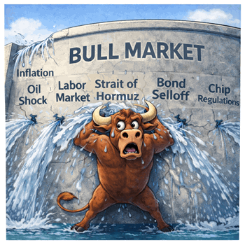
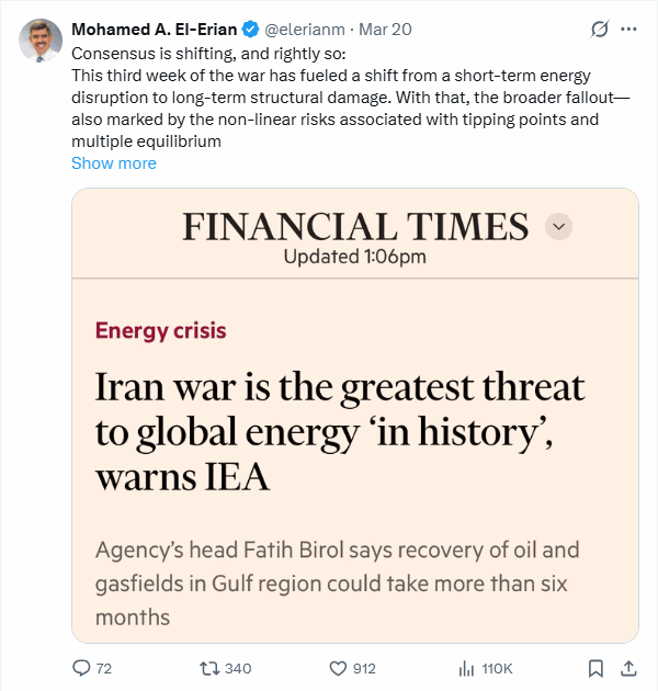
Last weeks Market Outlook was titled, “Time is Running Out” which followed the previous week’s article “Was Last Week The Tipping Point for Stocks”. Both were conclusions that the market was losing its battle to stay bullish based on the PRIME framework.
Now two, weeks after the “Tipping Point” conclusion the image we created for that article (below) seems all too real as both the S&P 500 and Nasdaq 100 markets have closed below their 200-day moving averages.

Markets breaking a 200-day moving averages that has not been breached for a long time will get the attention of even the investors who don’t care much about charts. You don’t have to be a market technician to respect the fact that bad things happen under the 200-day MA. Institutions are influenced by it.
Gina Martin Adams, Chief Market Strategist at HB Wealth
“Drops below the moving average have historically triggered more volatile trading… Since 1990, 45 of the 50 largest daily gains and 48 of the 50 worst losses occurred when the S&P 500 was trading below its 200-day moving average. The VIX averaged 16.9 when the market was above the moving average, but surged to average 27.2 when the index was below the moving average.”
- Gina Martin Adams, Chief Market Strategist at HB Wealth
A Framework For Using the 200-day MA To Reduce Risk Without Missing The Upside
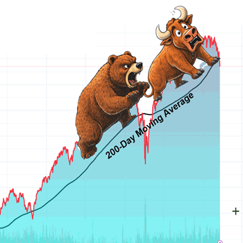
In the March 9, 2025 issue of Market Outlook “Under The Pressure of Tariffs: Trump, Powell, and Markets All Agree On This…”, I outlined a framework for how to trade around the 200-day moving average. The image below was the feature image for that week’s article, and as it clearly suggests the market was concerned that the economy would soon be in trouble because of the new and extreme tariff threats.

The objective of this framework is to help with two big problems investors face:
In the article there are a series of charts that show that using the 40-week moving average as a 200-day proxy you can avoid major declines and very volatile markets by exiting when the market is more than 5% below the 40-week average and re-enter when it closes 3% above the 40-week average.
You don’t need to literally exit your positions for this to be helpful. If you look at the charts you’ll see these patterns.
Below is one example of the charts. The yellow box indicated the “exit longs” period:
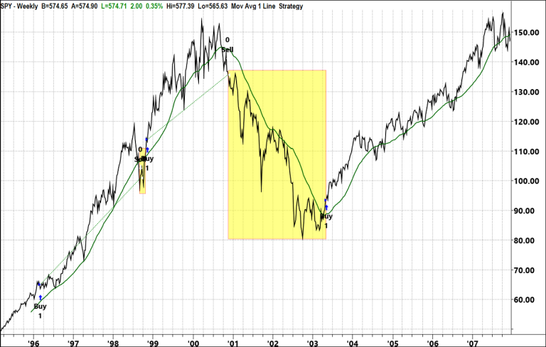
For more chart like this refer to the March 9, 2025 issue of Market Outlook “Under The Pressure of Tariffs: Trump, Powell, and Markets All Agree On This…”,
With The Break of The 200 DMA, It’s Time To Apply The PRIME Framework
This is the first time the market has been back under the 200-day average since the spring of 2025, and there are a lot of the same concerns, but there are also some very different circumstances.
4 of the 5 PRIME trend measures are already bearish, but the 5th one is the most significant, and the war is threatening to turn it bearish too.
The PRIME Framework
As with most good frameworks or methodologies, their basic principles which are helpful, and with experience you discover several levels of detail that make them even more powerful.
The PRIME framework is based on the idea that there are 5 primary conditions the influence a stock’s or market’s trend. They are as follows:
The PRIME method provides a simple way to measure all five elements:
The Current Market Conditions
In short, the market’s condition stacks up like this:
The Fading Growth Story
Let’s start with the good news.
The economy, which has been growing for some time has supported back to back years of double digit corporate earnings growth
The chart below shows analysts are expecting 16% EPS growth in 2026 and 15% in 2027.
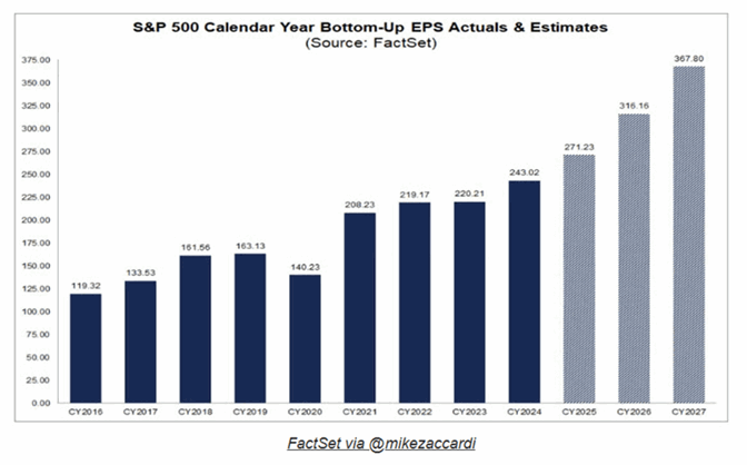
As a result of the strength in earnings and expectations, the current market correction reduces the bearish argument of high valuations by compressing earnings multiples. This is shown in the chart below.
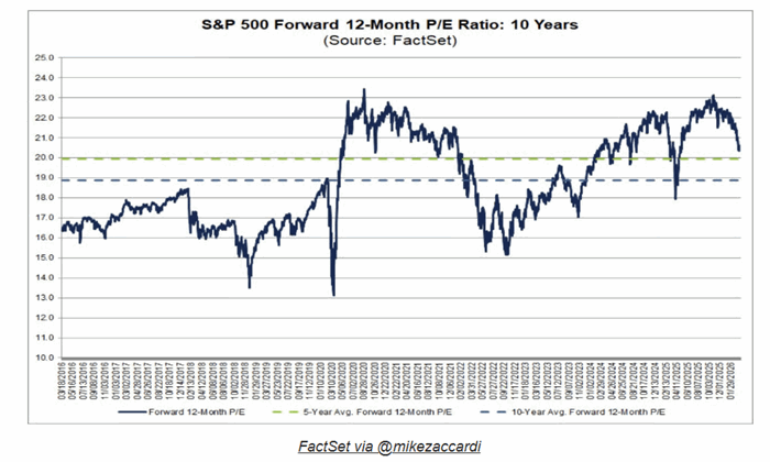
Will Companies Deliver EPS Growth?
The Iran war has created multiple shocks to the economy and introduced a level of uncertainty that threatens the most important part of the “E” in the PRIME framework.
The growth story is important. It can hold up a trend that suffers from bearish conditions in all 4 other factors until they recover, but it’s dependent on Expectations. Expectations are emotional. If the market loses confidence in the economy and corporations’ ability to grow, there can be a self-fulling feedback loop.
Falling stock prices, dampen confidence, reduce consumer spending, and as a result become a headwind for growth.
This is the “tipping point” I referred to two weeks ago. This is the danger of reading quotes like this in the media,
“The market sellers have finally showed up”
- Ross Gerber, co-founder, president and CEO of Gerber Kawasaki Wealth and Investment Management.
Higher Energy Prices & Rising Inflation Expectations Hurt Growth Expectations
Even the optimist who thinks the price shock of a 50% rise in the price oil since the war will be temporary, would most likely agree that the longer the price of oil stays elevated, the less likely it is the shock will be transitory.
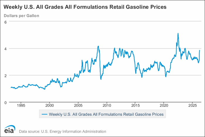
Consumers watching the price of the average gallon of gas go up 30% in three weeks to a national average of $3.85 will tend to pull back on spending even if they can afford not to.
As you can see by the chart below, gas prices are at levels that will be viewed as high as many consumers have ever seen.
Rising inflation expectations play havoc with the bond markets. They deter the Fed from lowering rates, and prompt bond holders to demand lower prices to buy bonds.
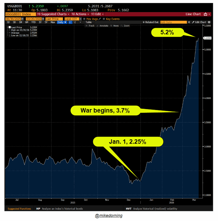
The market’s popular market based measure of 1-year inflation expectations is the 1-year breakeven inflation rate which compares the yield on a normal 1‑year government bond with the yield on a 1‑year inflation‑protected bond.
As you can see in the chart below, this measure expects inflation to exceed 5% within 12 months.
The change in expectations from the Fed lowering rates to pausing has mirrored the moves in energy.
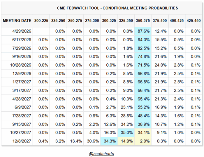
Right up to the start of the war, markets were pricing in two potential cuts this year. Now the odds are 80% there will be no cuts in 2026
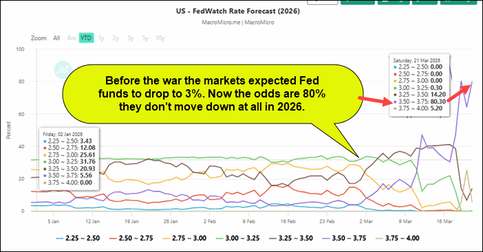
In fact, the table below suggests that rates will stay the same until October 2027.
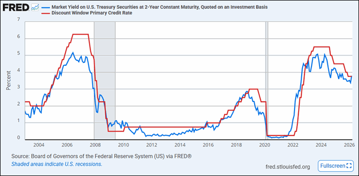
Worse, the 2-year treasury is close to trading over the Fed Funds yield. This is interpreted as a signal that the market thinks the Fed should raise rates.
More troubling is how the pattern in the chart below suggests that if the 2-year exceeds the Fed Funds rate in a meaningful way it has historically indicated a trend change.
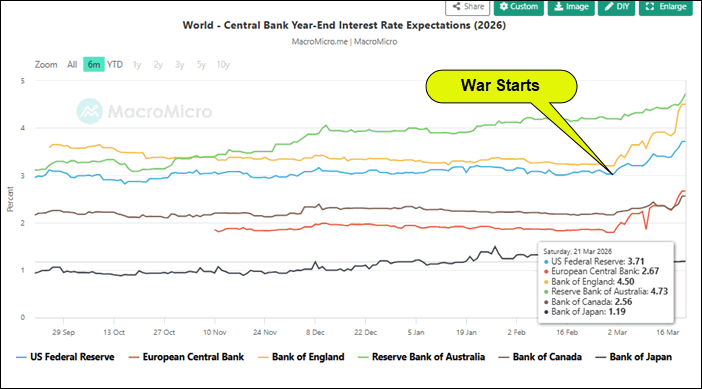
Expectations For Rates Is “Higher Globally”
Pressure for higher rates isn’t just in the US. As you can see in the chart below, expectations of where global central bank rates will end the year have risen dramatically since the start of the war.
Will The Economy and Corporate Profits Survive The Rate Shock?
When economic growth is strong and corporate revenues and profits are growing with stable margins, higher rates can be absorbed.
However, rapid interest rate changes are more likely to cause problems if they don’t reverse quickly.
With every day the war continues the disruptions to energy facilities and other negative consequences increase and extend the time it will take for the energy industry and global trade to recover.
Fortunately, the AI revolution continues to transform the productive potential for individuals and companies. The expectations are still bullish in several tech related and energy related sectors which could lift the industrial sector again as they did prior to the war.
The Market’s Message
The S&P 500 trading below its 200-day moving average is both a real and symbolic indication that big trends are turning down. The 200-day moving average area is also where the optimistic investors often find value and reverse the bearish correction.
Investors have been reluctant to give up on the bull trend despite very bearish implications of the war. The expectations of a resilient economy and continued profit expansion had kept the correction orderly and filled with healthy rotation, until the Iran war.
As I stated above and Keith demonstrates in the weekly video, all the other conditions in the PRIME framework have either turned bearish or become more decidedly bearish in the last month.
In future articles we’ll apply the PRIME framework to sectors and stocks that are bucking the bearish trend to find the bullish trends in bear markets, but for now watch the market for these trends to continue (bearish) or change (bullish):
Markets shift slowly and then all of a sudden, this last chart is one that has the potential to get popular quickly, and that would kill the E in PRIME.
Keep your finger on the pulse of the market narrative around growth. It’s important.
Join the conversation…
If you’re reading this on Seeking Alpha leave a comment (I read them).
You can find our articles on Seeking Alpha here (usually publishes Monday)
Coming up next…
Next week we’ll use PRIME to find the new leaders and define what a durable reversal of this correction will look like. Until then…
Want Help Making Sure You See What’s Coming?
If you'd like access to the MarketGauge indicators, strategies, automated trading models, and more, contact us.
Best wishes for your trading,
Geoff Bysshe
Co-Founder
(Connect on LinkedIn)
 |
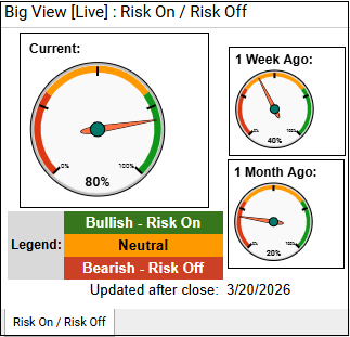 Every week we review the big picture of the market's technical condition as seen through the lens of our Big View data charts. Every week we review the big picture of the market's technical condition as seen through the lens of our Big View data charts.
The bullets provide a quick summary organized by conditions we see as being risk-on, risk-off, or neutral. The video analysis dives deeper. |
Summary: Risk conditions remain broadly negative as markets decline across the board with weak internals, poor breadth, and global equity pressure. Stable volatility and resilience in bitcoin suggest underlying support, though the overall environment points to continued caution with a potential for a near-term reversal if oversold signals reverse.
Risk On
Neutral
Risk Off

Every week you'll gain actionable insight with: