October 11, 2015
Trades & Tutorials
By Geoff Bysshe
Have you ever felt as though it’s harder to trade on certain days of the week, or that the market is particularly bullish or bearish on certain days of the week?
Well, you’re right!
For example, in 2015 the best day of the week has moved up off its open 63% of the time, but the worst day has moved up off its open only 37% of the time! Which day would you rather be trading on the long side?
Last week I hosted a training session to show you how to gain an edge in your trading based on how the market trades around its opening range. As a follow up to that concept, this week’s Market Outlook will show you how there are some days of the week that have a higher probability of moving higher from their open based on the day of the week.
It’s not as crazy as it might sound…
Since markets are a reflection of trader’s emotions, and human emotions are impacted by the day of the week, this is not as crazy an idea as some might think. And, as I’ve hinted above, the results speak for themselves.
For example, the S&P 500 as measured by the SPY ETF opened 2015 at 206.38, and last Friday it closed at 201.33. This means it has lost 5.05 points or 2.4% this year. However, if you’d avoided owning the SPY on Friday’s by selling at Thursday’s close and buying on Monday’s open you’re 2015 P&L would be up 5.76 points or up +2.7%.
And it’s not just that Fridays have lost money overall. They have also gapped down 61% of the days, and they have closed lower than their open 67% of the time.
So if you’ve been feeling like Friday has been a hard day to be long, there is a very real reason for it! Friday’s clearly been worst day of the week to own stocks all year. I fact, on average, it’s also been the worst day of the week to own stocks since the market’s 2009 low.
Ironically, despite its weak performance, Friday has also provided the best one day open to close move to the upside in 2015. This reminds me of an important lesson in trading… consistent profits are better than swinging for “the big one” because one great day doesn’t always pay for a bad year.
So now you know… Avoid Friday’s, but more importantly…
Don’t miss Wednesdays and Thursdays!
Even more productive than simply avoiding Friday would have been to employ a 2 day mid-week work week. Here’s how it works…
If you had simply bought the SPY on Tuesday’s close and sold it on Thursday’s close, you’d be up 31.1 SPY points or + 15%! And emotionally, you would have enjoyed gaps in your favor 63% of the time, and a Thursday that rallied from its open 63% of the time.
How I Evaluated The Days, Gaps, and Time Periods
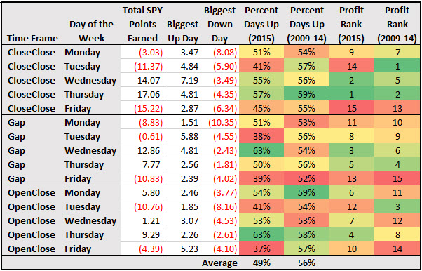
Below you’ll find a data table and chart that illustrates these and other interesting patterns. In this week’s video I’ll also quickly dig a little deeper into history and trends.
The ways this data can be dissected seem endless, but my objective was only to see if there are any very big and obvious patterns that can increase our trading edge by identifying consistent and substantial directional biases on certain days of the week. If they exist then we will know which trading strategies to favor on certain days of the week.
As you’ll see in the table above, I’ve provided you with the data so you can draw your own additional conclusions in addition to the ones I highlight for you.
Here’s how the data was compiled and displayed.
I looked at two time periods. For “history” I looked at March 2009 through December 2014 because that has represents the trending market we’ve experienced since the bear market low. The second period is 2015 through October 9th. This way we can see if the current market has changed or is consistent with history.
In fact, in many ways 2015 has been a year in which prior patterns became even more pronounced! The two examples I’ve mentioned above are examples of this.
A “Day” has two parts
To measure a “weekday” I broke it into two time frames. The first time frame is the “Gap” into the day (i.e. the Wednesday Gap is the price change from Tuesday’s close to Wednesday’s open). The second time frame is the Open to the Close of the day, “OpenClose”.
For convenient analysis, I also consolidated the two daily time frames into a period called “CloseClose”.
By breaking the day up this way the day trader can see how a day performs without having to hold overnight. You can also see the effect of gaps on longer-term performance.
Additionally, I recorded the “Biggest Up Day”, and down day, so we can see how much of an impact one day has on the data. For example, I’m sure many of you would ask, how did the recent August gap down crash Monday impact the data?
You can see it as the biggest down gap for Monday at -10.35 points. You can also conclude that had it not happened, Monday could have been a net positive gapping day for the year.
Daily Returns and Probabilities
I measured performance in two ways.
To enhance the analysis, I also ranked the results of the points gained to create rank value ranging from 1 for the most points gained to 15 for the least points gained (as was the case in the history period) or the most points lost (as was the case in 2015) for each weekday time frame. This way you can quickly see which time frame gained most points.
So for each week day you can see 3 time frames (CloseClose, Gap, OpenClose) and easily compare and contrast the percentage of days a time frame has had a positive bias (Percent Days Up), and how it has ranked in terms of its gain or loss of SPY points (Profit Rank).
You can also compare each metric’s results for 2015 to history.
For 2015 you can also see the actual value of SPY points gained or lost by time frame. I did not I compare the actual SPY points in 2015 to the history. Actual point gains or losses in 2009 are not a fair comparison to actual point gains or losses in 2015 because the index has nearly tripled in price over that time period
Instead of an actual points comparison, I used the ranking system which yields the more relevant answer of which days are “best” or “worst” and is it consistent over time.
For example, if you look at the 5 row in the table above, “CloseClose” “Friday”, in the two right most columns you’ll see that in 2015, Friday’s CloseClose time frame was the worst performing weekday and time frame based on SPY points because it is ranked 15.
Interestingly, even in the bull move of the history period (March 2009- Dec. 20014), this was one of the worst days and time frame combination.
If you follow the analysis of the ranks of 2009-14 down that column you’ll see that the real source of Friday’s weakness in the 2009-14 period was its gap (ranked 15). But its OpenClose was a poor performer too (ranked 14).
Finally, the coloring of the cells is based on the range of each column respectively. The colors range from dark green as bullish (the highest percentage up days, and highest rank of 1), to red as the most bearish (lowest percentage of up days, and rank of 15).
Noteworthy patterns, especially for day traders…
The OpenClose time frame is the movement from the day’s open to its close.
The Percent Up Days in history ranged from 52% (Fridays) to 59% (Thursdays). In the day trader’s time frame, OpenClose, the best days were Monday (59%) and Thursday (58%), and the worst day was Wednesday (53%).
Part of this pattern has held true in 2015, and even been exaggerated. Thursday’s remained the best day and even became more bullish as it’s been up 63% of the time.
On the other hand, the worst day to be long from open to close has been Friday. It has only rallied 37% of the days. Historically Friday’s open to close performance had a bullish bias that was up 57% of the time.
Interestingly, during the bullish historical period, Monday was tied for the highest percent up days (59%). This makes intuitive sense as traders would be inclined to get long for the upcoming week. In 2015, this bias dropped modestly to 54%.
The biggest changes for 2015 came in Tuesdays and Fridays.
Friday’s 2015 OpenClose Percent Up Days at 37% is the worst performance of any time frame or day. This makes sense if you consider the idea that traders will be more likely to take profits or reduce exposure going into a weekend when the market’s trend is down or uncertain!
This explanation is supported by the fact during the up trending historical period Friday’s OpenClose performance was a solid 57%. However, even with its bullish bias, it was one of the worst performing in Profit Rank (14). This is becuase the rallies were smaller than other days. Profit taking?
Tuesday also took a hit in 2015. In the past Tuesday’s OpenClose time period had the #3 Profit Rank and 54% Days Up. But in 2015 Tuesdays have only been up 41% of the time and its Profit rank is a lousy 12 having lost 12 SPY points!
I don’t know why Tuesday’s have been so bearish, but it’s good to know that the odds are not in your favor as a bull on Tuesdays right now!
Patterns for swing traders
Since the swing trader can take advantage of the gap from day to day, the easiest way to see where the money is made or lost is to look at the CloseClose time frame. This time frame includes the gap into the day and then the trading through the close.
A quick look at Total SPY points or Profit Rank will reveal the same answer because Profit Rank is the ranking of SPY points. The answer for 2015 is clearly that ALL the money made in the SPY has happened on Wednesdays and Thursdays!
Wednesdays and Thursdays are the only days with CloseClose gains in Total SPY Points and their profit Ranks are 2 and 1 respectively.
If you look at the CloseClose Profit Rank for 2009-14 you’ll find that for Thursday has historically been very profitable (Profit Rank of 2). Wednesday’s CloseClose Profit Rank historically is 5 which indicates it has also been is a solid performer in the past.
Where did the bears impact 2015?
One of the biggest bearish shifts in 2015 has been Tuesday which has fallen from the best CloseClose performer historically to the second worst in 2015!
A quick look at the other two time frames for Tuesday reveals that the weakness on Tuesday’s is not the gap. As mentioned above, Tuesday’s OpenClose time has been even worse than Friday’s based on Profit Rank. Plus, its Percentage Up Days is a very weak 41%.
Summary
As you can see, each day of the week can have a very consistent and different trading personality!
In conclusion, as the 6 year old bull market moved from a strong bullish trend into a choppy and then bearish market condition in 2015, Thursday remained the most bullish day of the week, while Friday’s and Tuesdays became bearish days.
P.S. It gets even more interesting!
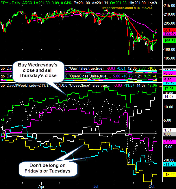
Below in chart #1 you’ll find a chart of each day for two timeframe, the Gap in the middle chart and the OpenClose in the bottom chart. In chart #2 you’ll see the CloseClose time frame.
The colors represent the following days of the week.
Monday – Magenta
Tuesday – Cyan (light blue)
Wednesday – White
Thursday – Green
Friday - Yellow
By viewing the data this way you can see not only how different each day can be but also that their “personalities” trend! In other words, a day of the week can go through cycle of being bullish for a while and then becoming bearish.
Also notice how the individual trends often go in very different directions.
Chart #1: SPY with points gained and lost in time frames of
the "Gap" and "OpenClosed"
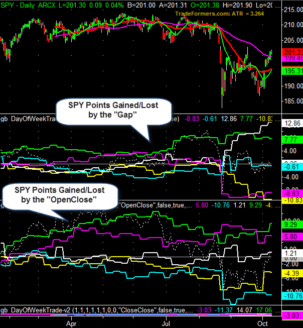
Chart #2: SPY with points gained and lost by the full day
time frame of "CloseClose"
When you look at the data closely you’ll find interesting patterns like….
Want more?
Check out this weeks video for more history and patterns based on the day of the week here:
If you’ve found this article helpful or simply interesting and you’d like more similar market insights make sure you follow us on twitter at @marketgauge where I’ll be positing more frequent updates to topics like this one discussed in Market Outlook and our blog.
Also make sure you don’t miss our next email by confirming your subscription to our free resources like this, Market Outlook, Mish’s Daily, and following Mish at @marketminute.

Every week you'll gain actionable insight with: