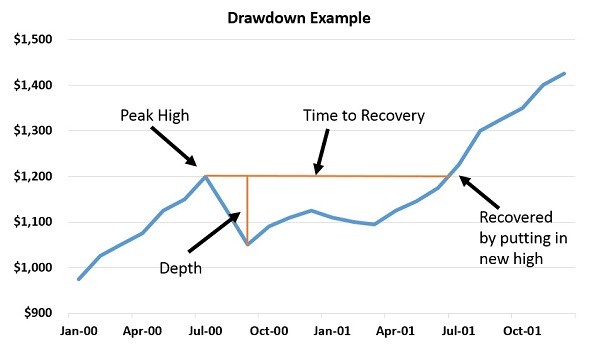
Many times, drawdowns are illustrated with a special type of chart (lower blue-line portion above). This chart plots the difference between the current price and the prior recent or all-time high in percentage terms. If a stock is trading at $45 and had a recent high of $50, the blue line would show a negative 10% value.
Typical drawdown charts don’t show the overall positive or negative change in equity value—and it can often be hard to determine or even guess that value just by looking at a drawdown chart.
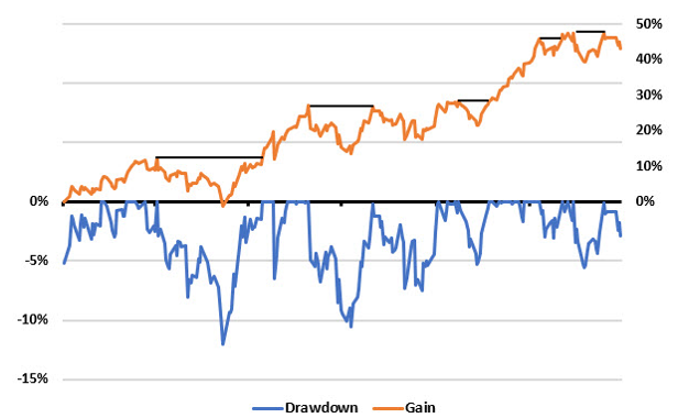
In the chart above, we included the equity in orange above the drawdown portion of the chart. We made the percentage scaling for the upper and lower portions of the chart different as well as adding some black lines on the equity to help illustrate some of the drawdowns.
If a trader had a rule that they would stop trading a system after a 5% or 10% drawdown, they would have hit either of those levels, been stopped out, and could have missed out on the next leg up. It isn’t that you should ignore drawdowns or “never sell,” its more about setting expectations and trading guidelines that are appropriate to what you are trading.
If you want to trade say the Sector Moderate model, there is a certain amount of volatility that goes along with that and you should position-size so that the normal volatility of the model won’t force you out.
Next week we will expand on this analysis and look at the drawdown profile for a number of other instruments and models.