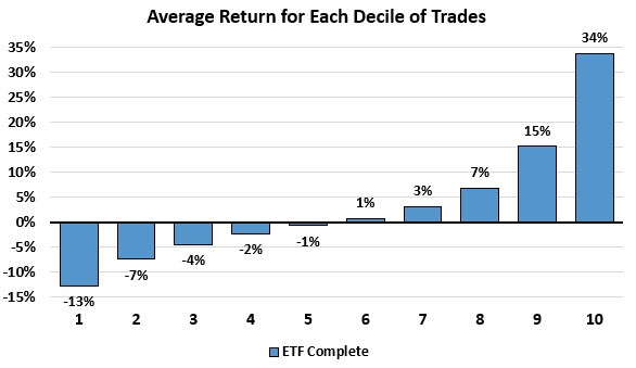
The chart above takes all the ETF complete trades and breaks them down into 10 equally-likely buckets. This means that for any given trade you put on, like the recent new trade in Treasuries or gold miners, you have about a 10% chance of roughly getting one of the outcomes above.
There are few things we can observe from the data above that adds to our understanding over and above the simple 3.22% average outcome. With the first five deciles showing negative outcomes and the second five showing positive outcomes, we could say that each trade we put on has roughly equal odds of ending positive or negative.
However, the positive and negative outcomes, while equally-likely, have very different end values. The distribution of trades is skewed positive with the best average bracket gain being about three times higher than the worst average bracket loss.
We also have a middle section of the chart above with a lot of marginal outcomes that cancel each other out. While we would love for every trade to be a winner and post massive gains, unfortunately, we don’t know which trade signal will be that next big trade. The best we can is that a particular number of them will do great, many will effectively breakeven, and a few will do poorly.
Understanding these probabilities can keep our expectations in line with the model’s history and help us to stick with the rules even if we have a series of lackluster trades in a row or a period of underperformance because we know that in the long run, taking all the trades offers a strong expected value.
Next week we are going to expand our analysis and look at some other stats and how the trade performance skews between the models.